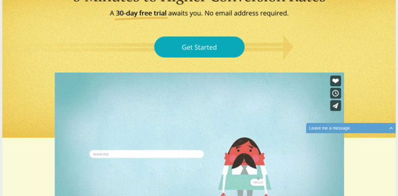
Landing pages are designed for two specific things, one, to draw in and win over the prospect’s trust, and two, ultimately converting, as a sale or generation of a new contact. The best way to build trust and bring out the story of a brand or a product, enticing the contact to purchase, is to give them an experience.
Your video landing page can also be the home for a specific video tied to the campaign. The home is the master location where the video will live, so when anyone wants to share the video, they will link back to this unique URL. Associating a video asset with a unique location on the web is key for not only your campaigns, but it also has SEO benefits.
The home for your video (landing page) is typically called the “Playback Page,” this is will be where all viewing will take place and is also a great place to put a call-to-action in or around the video player. There are many different designs and styles for laying out video on a campaign landing page.
Here are 4 example of video landing pages that we love:
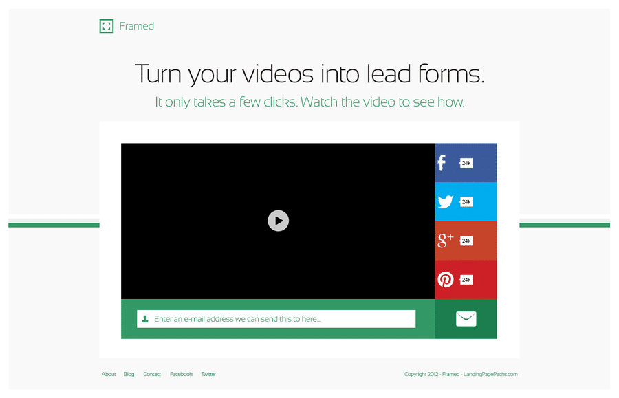
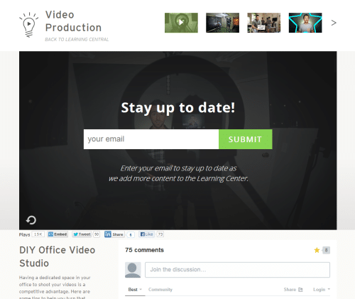
1. The video is the page and the call-to-action is in the video
In this example, the video player itself is the main attraction on the landing page. Notice that the only other call to actions besides the email address request are the social shares. If using a video marketing software platform, CTAs in the player itself are really easy to create and track analytics around.
2. Video placed with simple call-to-action (No Form)
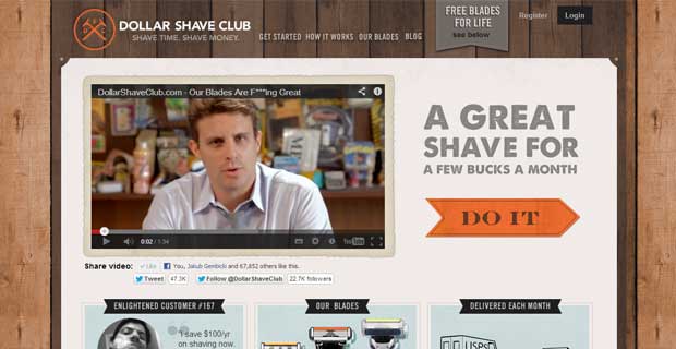
Here we have the Dollar Shave Club, which is famous for a viral video they produced nearly 3 years ago. Since the design of this page is strictly for a market that is consumer (B2C instead of B2B) a YouTube video player is okay. If this example were for a B2B brand looking to convert contacts, we would advise against YouTube.
What’s really nice about this example is that there is only ONE clear call to action, and its not a form, but a button “DO IT” which most likely leads to a page that has a form. The psychology put in place by not having a form on this page, most likely plays into an increased conversion rate. If you are a male between 25-50 years old, you would watch this video and click the button.
3. Minimal video landing page with two choices
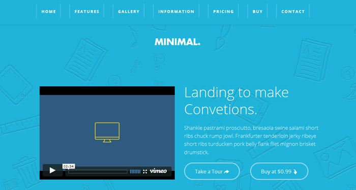
This next landing page is exactly what the template title suggests, minimal. There are two choices once the viewer has completed the video, the first is to take a tour of the software or purchase it. These two options are what we would call soft CTAs because, there may not be a strong conversion point upon completing the “Take a Tour” option, only “Buy Now” will convert immediately. Simple and minimal with a soft CTA works for some use cases.
4. In-video form placed on a landing page tied to a video library
This example is great for use cases where the conversion objective is light and casual, and more than one video is involved. For example, if you are running a campaign that involves multiple stories or videos you can located them in one central place, give viewers the ability to interact with that content and convert without disrupting the video viewing experience or flow.
There are great video marketing software solutions out there that make it very easy to place forms and other CTAs in video.
To learn more about video landing pages, contact our video strategy team to schedule phone short session to see more.

